BRAND GUIDELINES
Making sure our brand is consistent across all boards, we have provided you with these general rules to follow.
LOGO
We aim to expand our brand across the globe making our resin available to the world. The logo is an integral park of the ArtResin brand and should be used thoughtfully and consistently.

LOGO VARIATIONS
In most cases the logo is in full color but it can also be used as solid black or white.

FULL COLOR – This form of the logo must only be used against very light backgrounds or a white box must be used behind it when it is used on busier backgrounds.

BLACK OUT – This form of the logo must only be used against very light backgrounds or a white box must be used behind it when it is used on busier backgrounds.

WHITE OUT – This form of the logo must only be used against very dark backgrounds or a black box must be used behind on busier backgrounds.
THE ICON
Some rules are necessary for maintaining the integrity of the brand. Do not comprimise the overall look of the icon by rotating, skewing, or distorting it in any way. This includes adding any text decoration like outlines, drop shadows and patterns.

DONT’s
Here are some examples of ways you should NEVER consider using the ArtResin heart icon.
Don’t squish or stretch
Don’t tilt the icon
Don’t add a drop shadow
Don’t add an outer glow
Don’t add an inner glow
Don’t fade the icon
Don’t place a pattern in the icon
Don’t mask an image into the icon
COLOR
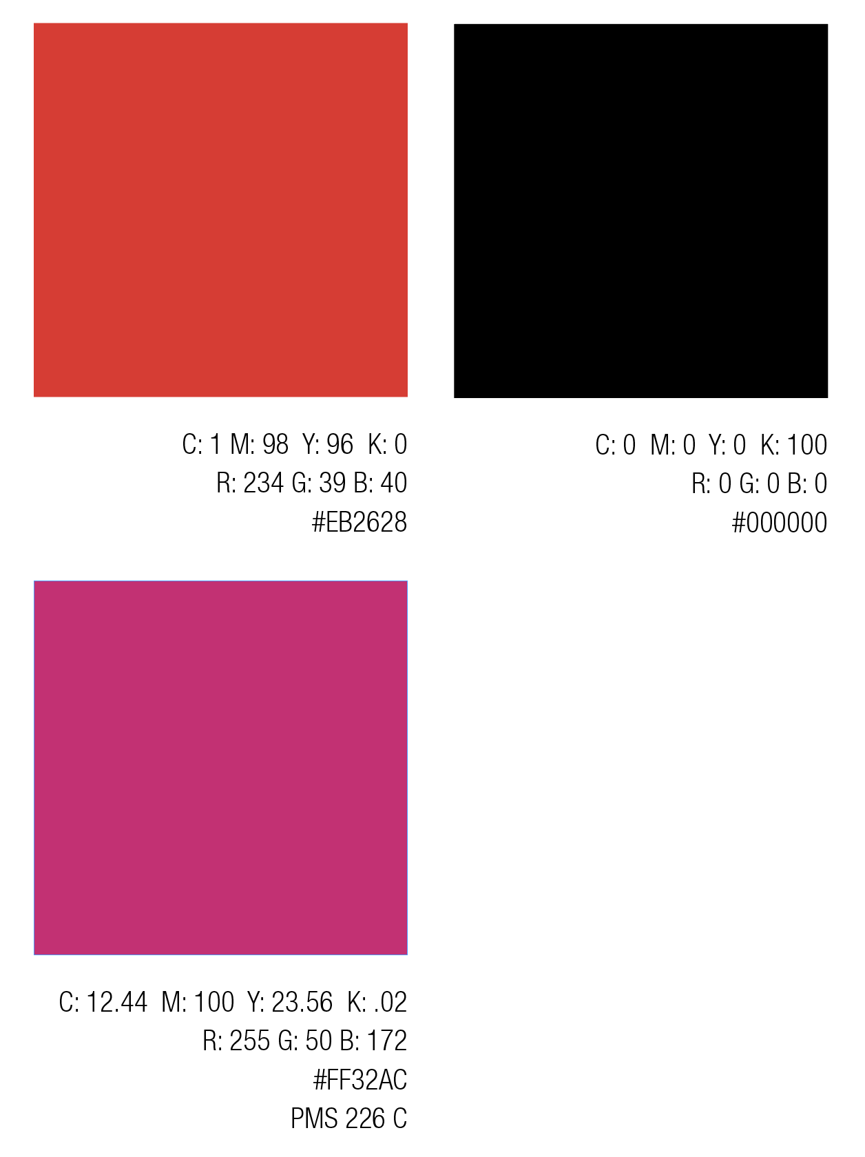
Color is an integral part of brand identity. Consistent use of the color palette will reinforce the cohesiveness of the brand. The colors of the brand are very minimal. The black and red are only used in the logo. While the ArtResin pink is used as an accent color. Do not use the ArtResin red for anything other than the logo.

TYPOGRAPHY
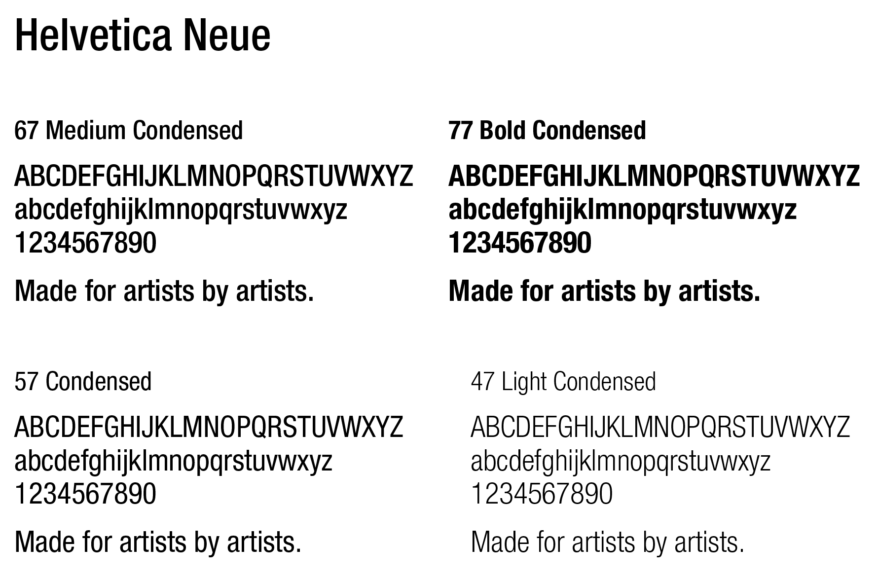
Typography is a powerful brand tool when used consistently. This set of typefaces should be used across all print, video and web applications. Helevtica Neue 67 Medium Condensed is the first choice when choosing the weight of the font.

